The Team is nothing without its fans!

The Pride Exceeds the Rink.
More than just fabric, it became a statement. A uniform that players could skate in with pride, representing not just their team, but their town, their families, and the spirit of the South Okanagan. Every stripe, stitch, and symbol was crafted with intention, built to command respect on the ice and unity in the locker room.
We brought the same energy to the stands with fan gear that turned supporters into part of the squad. Hoodies, hats, and merch that looked as sharp as the team itself, so whether you were playing, cheering, or repping the Soldiers around town, you wore that name with pride.


Creating the Brand.
Our Solution
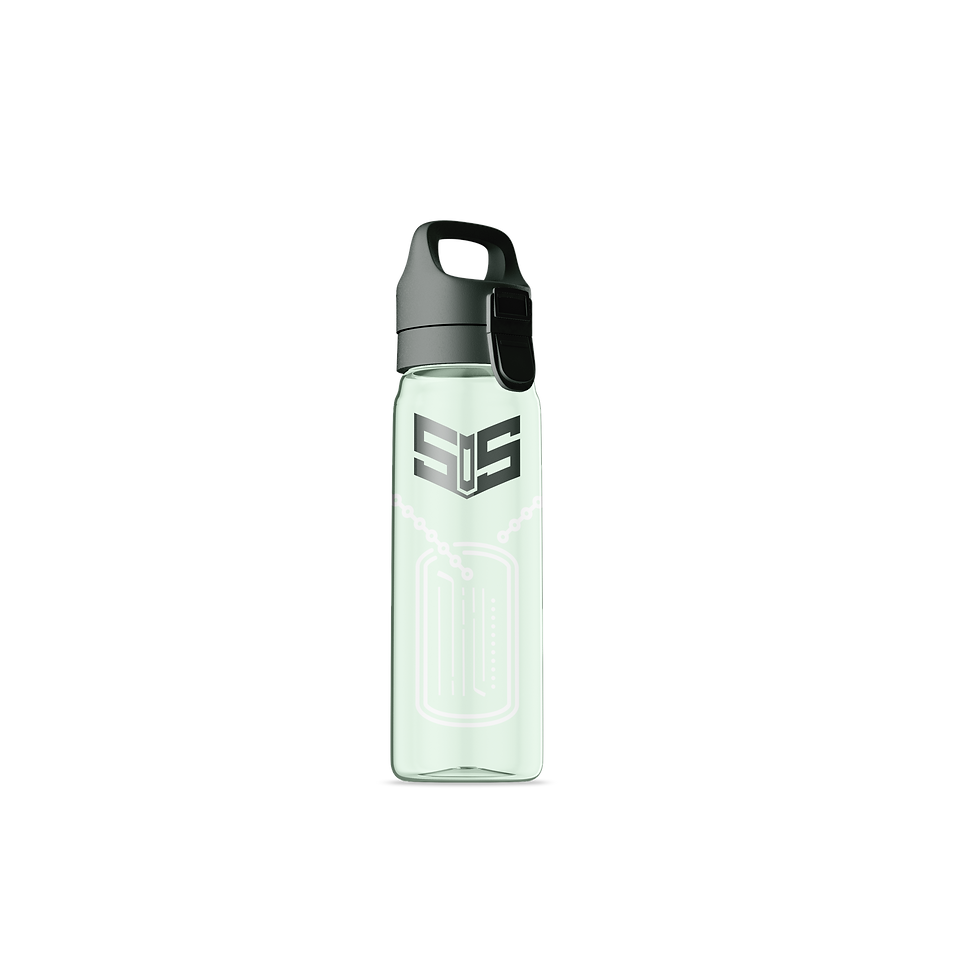
We gave the South Okanagan Soldiers more than just a logo; we gave them a whole damn identity. One that looked as tough as they play, and as proud as the community that backs them.
The Emblem

The Icon


More than just fabric, it became a statement. A uniform that players could skate in with pride, representing not just their team, but their town, their families, and the spirit of the South Okanagan. Every stripe, stitch, and symbol was crafted with intention, built to command respect on the ice and unity in the locker room.
This wasn’t a jersey for game day alone; it was a reminder of who they are every time they laced up. A bold identity worn with purpose, built to carry their story through every win, every loss, and every comeback.
The Jersey


Creating the Culture.
CASEwerk.
South Okanagan Soldiers Hockey
The Challenge
The South Okanagan Soldiers didn’t just want a logo slapped on a jersey. They wanted an identity with guts. Pride, strength, and a nod to their military-inspired roots, all wrapped up in something bold enough to own the ice and slick enough to sell off it.
This brand had to hold its ground everywhere; on jerseys, in the stands, and across fan gear and merch. Instantly recognizable. Unshakably strong. Basically, a look that said: “Try skating past us, we dare you.”

The Results.
The South Okanagan Soldiers project was more than a rebrand; it was a full transformation. What started as a simple logo request turned into a complete identity that players could wear with pride and fans could rally behind.
We built more than visuals; we built belonging. Every piece, from the jersey to the fan merch, became a symbol of unity, strength, and community pride. The Soldiers didn’t just get a new look; they got a reason to stand taller, skate harder, and represent their hometown with heart.
This is what happens when design meets purpose; a team becomes a movement, and a brand becomes a battle cry.